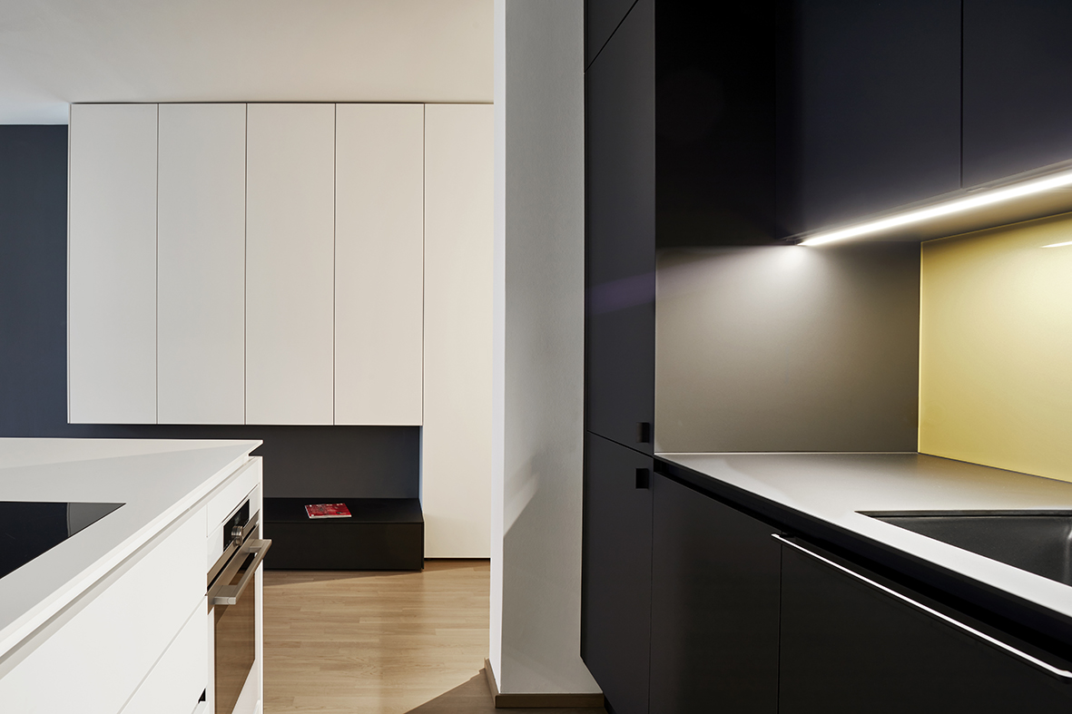
Contrasts in Harmony
Restrained design and clear geometric forms give residents the freedom to make the space their own.
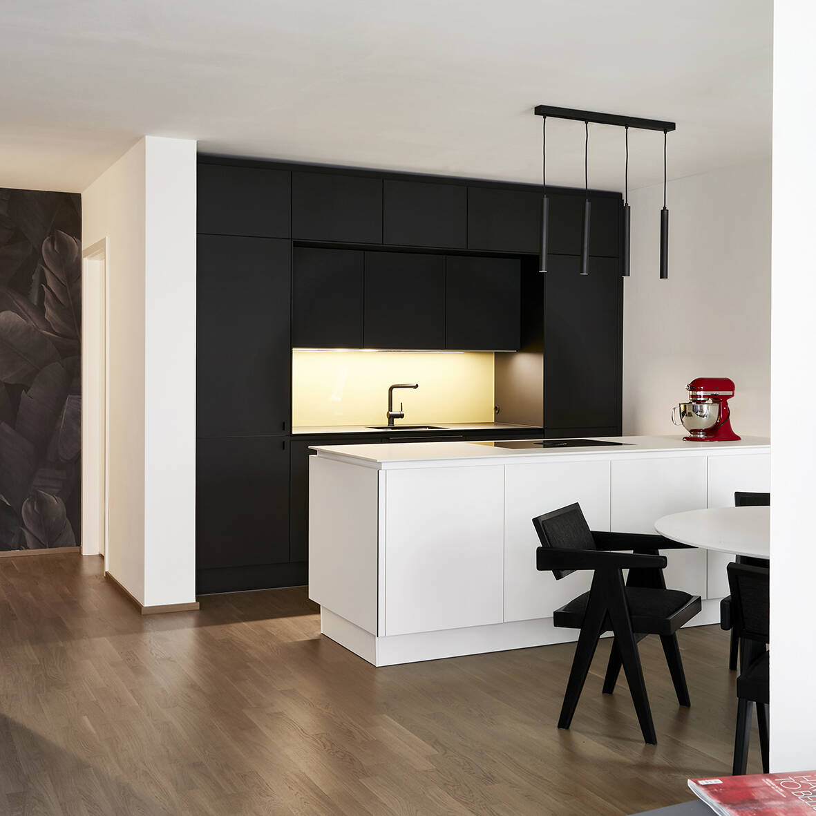
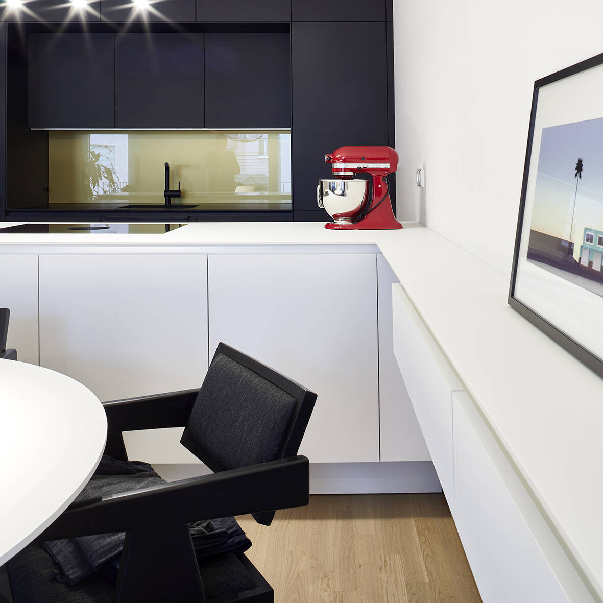
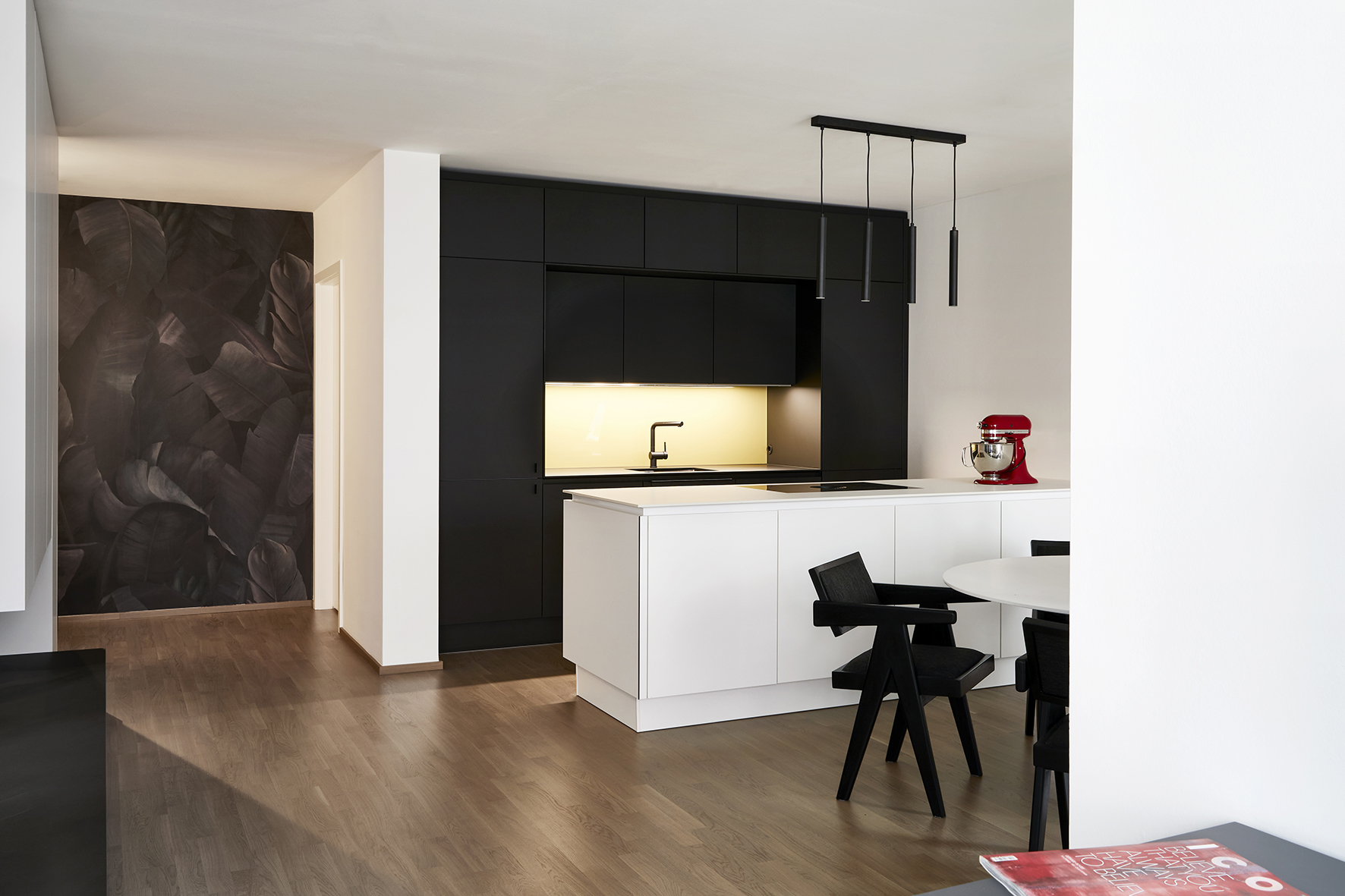
The apartment designed by TeamGeissert proves that seemingly conflicting client preferences can coexist beautifully. The homeowners' enthusiasm speaks volumes: "We couldn't be happier – I absolutely love the new kitchen, and the whole apartment has exceeded our expectations." The architects' approach – combining restrained design and clear formal language to maximize residents' freedom for personal expression – has delivered perfectly.
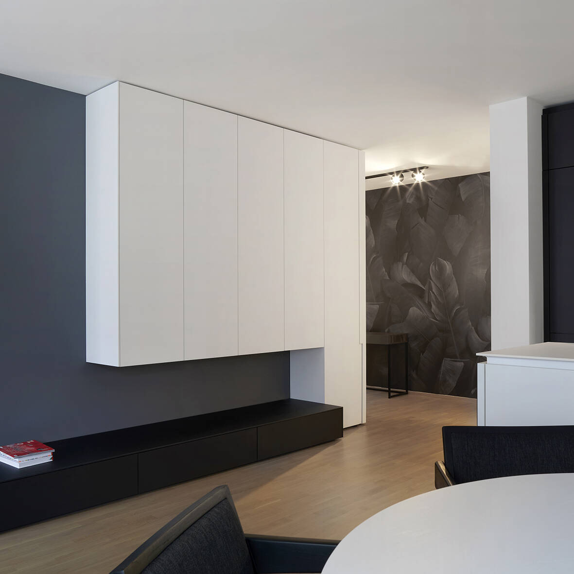
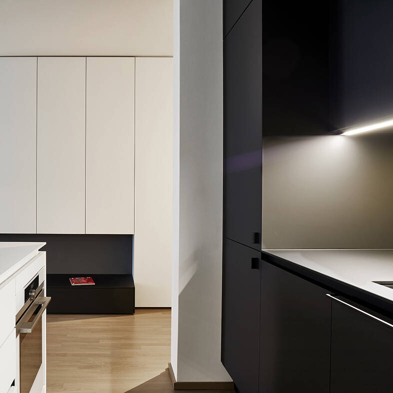
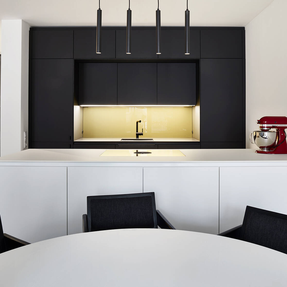
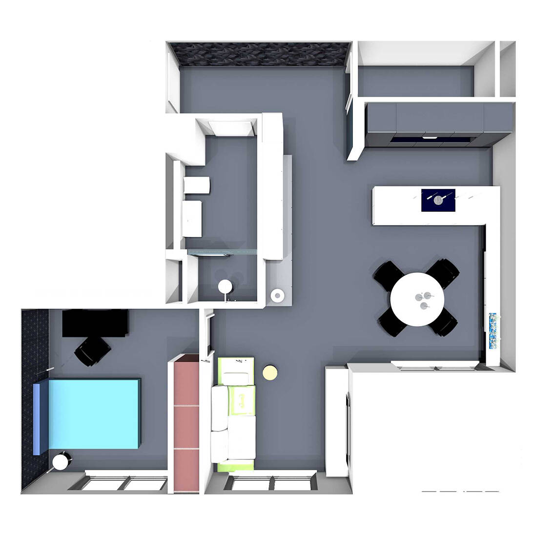
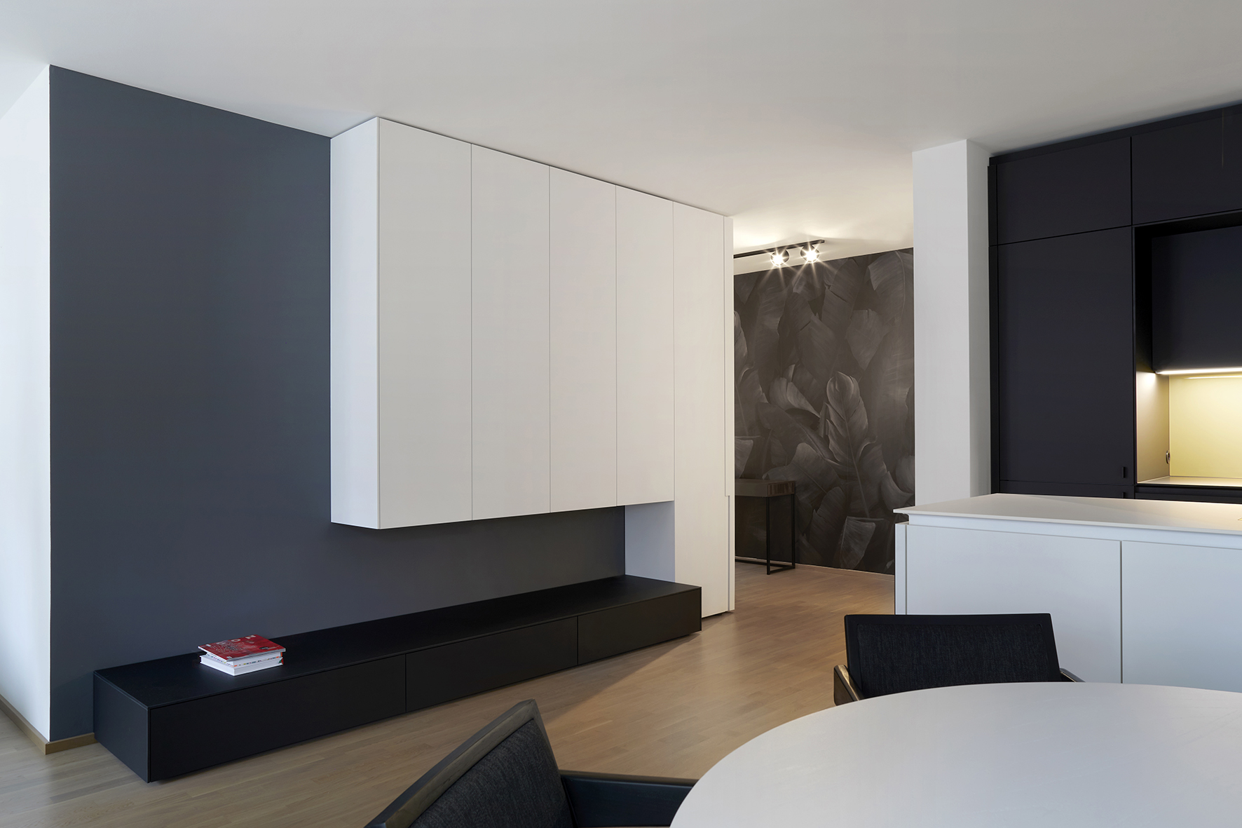
By playing light against dark, the architects created a dynamic sequence of spaces. This contrast strategy proved equally effective for storage: dark zones visually recede while bright areas feel more expansive, allowing the team to maximize storage without compromising the sense of spaciousness.
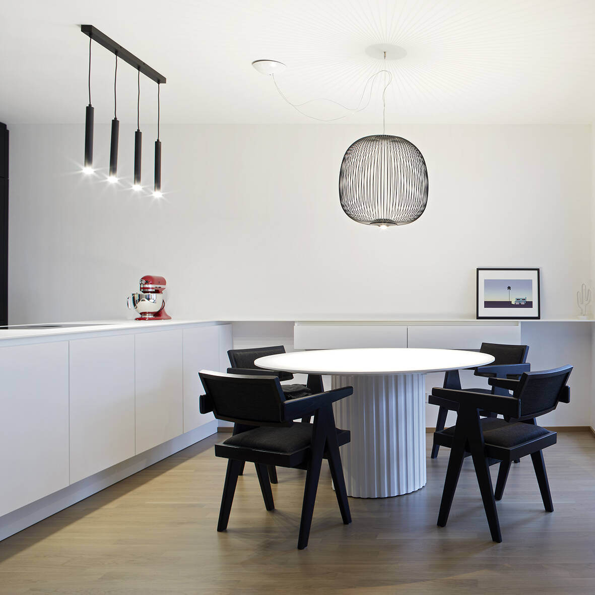
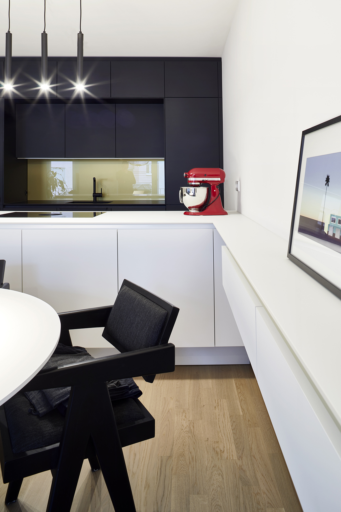
To establish a welcoming ambiance, the architects specified Fenix for all built-in cabinetry, kitchen surfaces, and architectural elements. Its soft tactile quality, ultra-matte finish, and minimal light reflection create an inviting feel. The material also proves remarkably durable against everyday wear. Lighting complements this carefully calibrated atmosphere—functional fixtures in darker zones work alongside decorative accents that draw the eye and enliven the space.
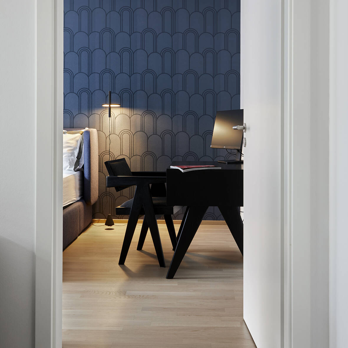
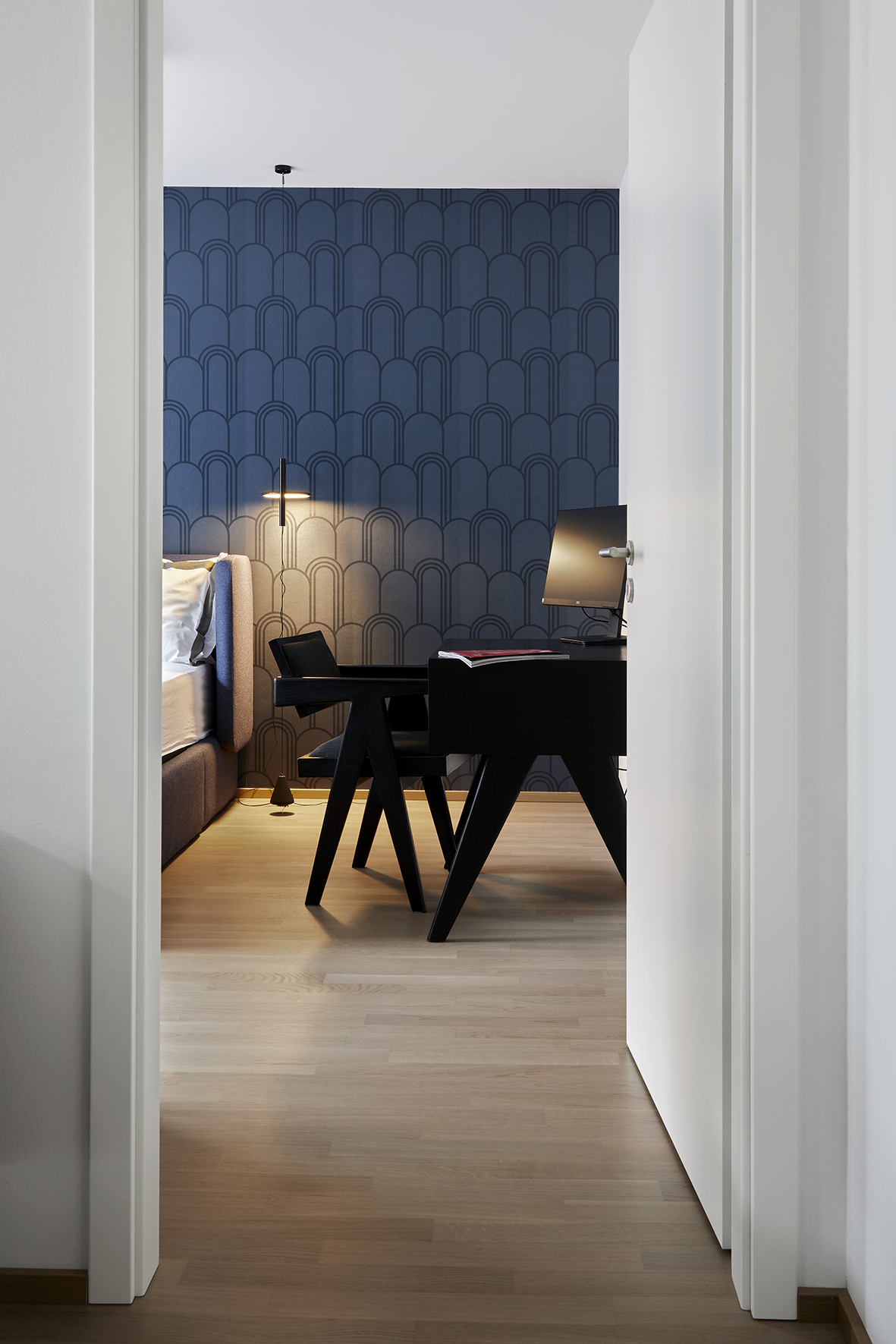
"The apartment's modern aesthetic is anchored in geometric forms, right angles, and parallel lines. Iconic pieces like the Chandigarh lounge chairs reinforce this refined, understated approach," notes Thomas Geissert. This elegant restraint belies the logistical choreography behind the scenes: with the handover postponed and the moving date fixed, the team prefabricated all furnishings and staged them with appliances and lighting fixtures, then assembled everything flawlessly in just two days.
Photography Credits:
Wolfgang Uhlig
www.wolfganguhlig.de
(Published in CUBE Frankfurt 04|22)
